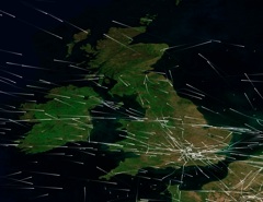
There are a lot of planes in the air, several thousand at any given time over the US. This animation shows all the tracked air traffic in the air at once. Each dot is a jet. Click on the image to see a 24 hour animation
The animation is interesting since it shows there are broad flight paths that a lot of planes follow. This (along with wind) explains the parallel trails, and the grids.
Given all these jets flying along regular airways, it’s hardly surprising that when the weather is right, that parallel persistent contrails will show up and then grids where the paths cross. In fact it’s surprising we don’t see more!
Hi from jazzroc
I’m carrying the torch for reason in the YouTube CT video community right now and wonder if I’m in touch with Epoxynous.
I spent a considerable amount of time working out what to say to these people before I discovered THIS site.
And what a pleasure this is!
Look me up on MySpace for pictorial and musical pleasure…
Tony
That’s me. I’ve not been on YouTube recently – maybe I’ll pop over and see what’s new.
Brilliant!
Let me say it’s been a pleasure to back-read what you’ve written.
And to say this site does a simple job (?) wonderfully well. Great pictures and on-the-button analysis. Every topic covered. Sledgehammer smashes fly. Fly emulates phoenix. Etc., etc.
I recommend these folk to your site, and it CONFIRMS their worst fears, unfortunately.
I try and comfort them by suggesting the fuel (and money) is running out, but these people are despondently waiting for an Armageddon, I think.
Tony
TONY, nothing to do with armageddon
we are being sprayed like insects
http://youtube.com/watch?v=okB-489l6MI
watch this video
Again, this video shows normal levels of barium. The reporter misread the lab report.
https://contrailscience.com/barium-chemtrails/
bulol,bull bull you show me actual proof and i will believe you we know what we see here and we are being sprayed .
why won’t the “government speak up????
Proof? Here’s the actual lab report. Barium levels are 68.8 ppb, EPA limits are 2000 ppb
https://contrailscience.com/wp-content/uploads/lab_results_1000x1375.jpg
What more proof do you need?
haha…looks like he has no answer after that curveball! keep up the good work uncinus!
I have been filming the skies for years and 15years ago there was never these “chemtrail” cross patterns that we see today in my old films.
That’s called a slider…
When did they first show up in your films? Was it actually before you started deliberately filming them? How many films did you make, and what time of year?
Contrails are not as common as people might suggest, especially in the summer. They tend not to show up in people’s normal snapshots and home videos.
For example, go to youtube, and search for “kites” or “hang gliding” or “RC Plane” or “plane spotting”, or any topic that has a lot of shots of sky. Then go through the videos and see what percentage of them have unusual contails in them.
It’s a very low percentage, I’ve not found any yet. So it’s hardly surprising that you don’t find them in your old films.
I think you are doing an excelent job here but even if this were happening do you honestly think any normal citizen would really know about it.
You know what you know but you wouldn’t know if this was a plot against humanity
and you couldn’t know if situations were manipulated. Reality is never what it seems.
I didn’t realize this site had an active gaurd on it…super fast response!
Well, rather a lot of people seem to think they know about it, which by your logic suggests it is not happening 🙂
Like I said it’s forever in ? in my mind. It wouldn’t surprise me considering all the other crap that goes on though..good talking to you…take care..
“In fact it’s surprising we don’t see more!”
Yes, it is surprising we don’t see more. Only four or five times a month in the area we are in.
If that many friggin’ jets are flying around up there it is peculiar weather conditions only permit this sporadically.
Especially at the times some of these planes seem to be flying lower than the daily cloud cover.
“Contrails are not as common as people might suggest, especially in the summer. ”
That is not only a crock, but it is indeed a super crock! Maybe even a crock and a half, or a crock & three quarters!
In this area all summer long persisting and expanding contrails are clearly visible to the naked eye,
( even to the clothed eye, that was a bad joke…..)
I won’t tell you the area, since you will probably check my ip address anyway and find out.
This whole thing can be solved once and for all very simply.
Have the “actual contrails” people see analyzed for content by some method,
I’m sure one such method must exist.
Find out where one of these planes takes off from and lands, exactly where…..why the hell not?
Is ther a method for that as well. Obviously I haven’t researched a lot of this…..I’m just free falling here…..
Speak directly to the animators and producers of these recent animated movies, like the team at Dreamworks etc…and find out what these people say.
Is there any vintage flight tracking data available? Obviously there must be some pre-1996, well somebody dig up that information and post it. So there can be compare and contrast. Why the hell not again?
This way we can verify the amount of increased flight traffic.
So once all that really nifty and fun-filled stuff is explained at a satisfactory level for all parties, this whole debate will be closed. Comprende?
As for memories, well…..(not the song)….. Myself, friends family etc, have been avid sky watchers since I was in short pants. We camped, hiked, played ball and always, always, looked at the sky. Did I say always?
Only a very, very small handful of times did any of us collectively agree that we witnessed those long white lines, then the expansion and all that cool stuff.
I was washing my car the other day and some guy working across the street asked me
“What the hell is going on up there?” I said I haven’t the foggiest. (no pun intended)
He and his friend remarked on the oddness of these planes and the activities.
A week before in the parking lot of Best Buy, some broad with her kid asked me the same thing.
We were both freaked out, a huge wispy sinister and strange looking trail was right above our heads at “what appeared” to be a significantly low altitude.
What are you gonna do…..?
Yes the weather is different in the troposphere. Yes humidity, winds, cold, altitude,speed and all that yawn inducing crap affects plane contrails. No sh@* Sherlock.
The point is that plenty of intelligent, grounded, reasonable, educated, observing, sober, and good people are seeing the same things.
Although, not in Russia, China, India or pockets of the middle east at all from what I’m gathering.
Not much jet traffic there?
Personally if it were true it might not be a bad idea anyway…..who knows?
Washencoop
some of these planes seem to be flying lower than the daily cloud cover – the local cloud cover, then, is HIGHER cirrus and not LOWER cumulus
Have the “actual contrails” analyzed – They have been analyzed to death. Use “advanced search” to RULE OUT words like CHEMTRAIL and AEROSOL
find out what these Dreamworks people say – That would be like finding out what YOU say
verify the amount of increased flight traffic – Figures are available for flight traffic from various unrelated sources. There’s no problem there…
So once all that stuff is explained, this whole debate will be closed – In a pig’s ear! There appears to be an expanded market of punters and paranoids. ANYONE explaining anything is a SHILL
Yes the weather is different in the troposphere – Seems to me you are a bit wobbly on this topic. Where’s the troposphere, exactly?
The point is that plenty of good people are seeing the same – It’s always been the same since it was first seen in 1921.
Personally if it were true it might not be a bad idea anyway – Which, cooling the Earth, or randomly murdering people with systemic poisons or invasive nanobots?
find out what these Dreamworks people say – “That would be like finding out what YOU say”
What the hell are you babbling about? (As usual it seems on this sight for this guy)
I’m talking about simply finding out their opinions on what people are saying on them purposely putting contrails all over the sky. You are obviously in another country or something, often you have difficulty with conversation comprehension.
So once all that stuff is explained, this whole debate will be closed –” In a pig’s ear!”
Yes, have you pig’s ear with elevator music and cheap wine.
Yes the weather is different in the troposphere – “Seems to me you are a bit wobbly on this topic. Where’s the troposphere, exactly?”
Probably between your ears, I made it clear, perfectly clear that I hadn’t fully researched that area, but was simply making a point. With all your sarcasm, you should of realized I was making a point.
The point is that plenty of good people are seeing the same –” It’s always been the same since it was first seen in 1921.”
No. Not nearly as much. Random sightings perhaps, that’s about it.
Personally if it were true it might not be a bad idea anyway – “Which, cooling the Earth, or randomly murdering people with systemic poisons or invasive nanobots?”
My answer to that…. whatever floats your boat son. I say son because it is entirely possible…
Washenwhatsit
“What the hell are you babbling about?” – That would be like finding out EXACTLY what YOU say.
“what people are saying on them purposely putting contrails all over the sky” – Depends on whether they’re getting from A to B. Or not.
“have you pig’s ear with elevator music and cheap wine” – A hot favorite in Madrid. All three. Pig’s ear is called “minutejos”.
“With all your sarcasm, you should of realized I was making a point” – What point was that. LOL
“No. Not nearly as much. Random sightings perhaps, that’s about it” – Well – it’s like the weather, isn’t it? Sometimes it’s cloudy, sometimes sunny, sometimes clear. But in the STRATOSPHERE it’s almost always clear, even when it may be humid or dry, and because it’s layered, BOTH.
“My answer to that…. whatever floats your boat son. I say son because it is entirely possible…” – ONLY IF YOU’RE EIGHTY-THREE. 🙂
JazzPop,
“What the hell are you babbling about?” – That would be like finding out EXACTLY what YOU say.
Ah…..in a pig’s ear.
“what people are saying on them purposely putting contrails all over the sky” – Depends on whether they’re getting from A to B. Or not.
or perhaps c or d.
“With all your sarcasm, you should of realized I was making a point” – What point was that. LOL
Precisely. LMAO
“No. Not nearly as much. Random sightings perhaps, that’s about it” – Well – it’s like the weather, isn’t it? Sometimes it’s cloudy, sometimes sunny, sometimes clear. But in the STRATOSPHERE it’s almost always clear, even when it may be humid or dry, and because it’s layered, BOTH.
…..sure as sugar or shore as sun
“My answer to that…. whatever floats your boat son. I say son because it is entirely possible…” – ONLY IF YOU’RE EIGHTY-THREE
Seventy one actually, but I started early….. I guess it would only take effect if you were as good looking as me.
I am just so glad that I don’t have to live in fear of the lines in the sky. It must be a horrible feeling to “believe” that your own people are spraying you like bugs. I’m so fortunate to have an education that proves otherwise.
Shill, you’re getting far too soft for everyone else’s good.
Washandrinse, you seem like my kind of old gnarled whippersnapper. Randy as you may be, I’m pretty sure you never tangled with my mom in bomb-ridden Liverpool in 1943, when you were six.
So I ain’t calling you Pop.
JazzWaltz
Your as off as off can be on my personal attributes. (Not surprising)
As for your mom, well your probably correct. I don’t bargain shop.
I’ll let you get the last word, it seems quite important to you.
You people always say the same thing,that its just contrails or that there is alot of jet traffic today.But that is not a sufficient explanation for what we are seeing in our skies.There is something else at work here.
The problem, chockie, is that you keep making claims, and then don’t back them up, like:
So where are these photos?
Where, for that matter, are any photos that YOU claim show something unusual, and cannot be explained by science?
I’d really like to see evidence of unusual contrails or planes spraying unusual trails. I invite you to show your evidence.
look at modis today sat images their is no denying look up. are food and water is poisoned know are air. hum I wonder?
look at modis today sat images their is no denying look up. are food and water is poisoned now are air. hum I wonder?
Your food is being poisoned by excessive pesticides due to industrialized agriculture. They want mass amount of food and for it to be perfect shape and without imperfections. This means the farmer loses majority of crops (Funny when they talk about food shortages that modern agriculture wastes about 30 to 50% of the crops produced). This leads to farmers using more pesticides. Monsanto’s push for GM crops is making matters worse. Making hybrid crops that are tolerant of pesticides and herbicides. Then add globalization to the picture and you have them using more preservation methods as they will grow a crop in England and then ship it to Poland to be packaged only to be sent back to England to be sold. Yes, big grocer food does have chemicals and they say they’re within the tolerant ranges set about by government regulators. However, if you were to feed a baby natural fruit, you put the child in danger as the regulation is for adult not child. So they recommend only using jarred baby food. That is unless you grow your own. In the end, the pesticides are still contaminating the environment as they only have interests in cleaning the crops, not so much the land.
Now that we see how industrialization can pollute the environment, what in God’s name makes you think a contrail can be an actual application spray? It would be the most frivalous waste of chemicals in the history of mankind. They wouldn’t be able to hide such mass amounts of chemicals. Someone’s stock portfolio would be golden for certain. It only takes common sense, but people live under air corridors and hear something scandalous and believe it without even using an bit of common sense. I mentioned industrialized farming as an example of all the chemicals and problems modern society faces and that is just 1 example. There are many different industries that have wastes and by products that contaminate the environment. Application spraying is like crop dusting and BP with their Corexit spraying. Also Agent Orange was application spraying. What does this have to do with Contrails? Nothing.
Some people will never figure it out that you can’t tell what is in a contrail without testing the contrail itself. Imagine standing on the street under a 30 story building…. One woman on the 10th floor is shaking her rug out to get the dirt out. Another man is spraying a Degreaser on the windows on the 21st floor, there is also a car on the street running while the courier is delivering something. Then in the sky there is a contrail. People forget all these things between them and the contrail. Add wind and the jet stream and you’ll be better trying to pee on someone’s head from the Eiffel tower than spraying a can of deoderant on their head from a airliner. This whole conspiracy is maddening.
Just received this in an email newsletter from Flight Safety Information:
“HONG KONG (Reuters) – European planemaker Airbus said it expects airlines in Asia to take delivery of 8,560 aircraft in the next 20 years, representing a third of the global total as the region’s fast-growing economic growth fuels demand for air travel.”
Just to give an idea of how many jets are still coming online – – theyexpect about 25,000 new jets in the next 20 years…..of course many will replace older ones that retire.